Pearson Correlation
sze 03 augusztus 2016 by Ernő GólyaThis is part of my coursework for the Data Analysis Tools course by Wesleyan University on Coursera.
Week 3 assignment: Generate a correlation coefficient.
The Pearson correlation coefficient (r) is a measure that determines the degree to which two variables' movements are associated. The range of values for the correlation coefficient is -1.0 to 1.0. If a calculated correlation is greater than 1.0 or less than -1.0, a mistake has been made. A correlation of -1.0 indicates a perfect negative linear relationship between the two variables, while a correlation of +1.0 indicates a perfect positive linear correlation. In both cases, knowing the value of one variable, one can predict the value of the second.
Data source: Gapminder World.
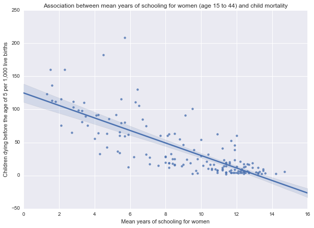
I want to compare the child mortality rates against years of schooling for women for the 154 countries in the data set. Both response variable (under-five mortality rate per 1,000 live births) and explanatory variable (mean years of schooling for women, age 15 to 44) are quantitative variables, thus Pearson correlation coefficient (r) can be used.
The scatterplot for the two variables seems to show a negative linear correlation:
    Output of pearsonr() function:
    Association between mean years of schooling for women (age 15 to 44) and child mortality
    (-0.78566944724891918, 1.6315641063941191e-33)
The correlation coefficient is -0.78, indicating a strong negative linear relationship.
The r^2^ value (coefficient of determination) is 0.608, meaning that 60.8% of the variability in the child mortality rate is described by the variation in female education.
The p-value is 1.63e-33, indicating that the correlation is statistically significant.
This suggests that an increased level of female education in a country is correlated with a decrease in the recorded child mortality rate, and the strength of association between the variables is high (r=-0.78).
Note, that Pearson's r is sensitive to outliers, which can have a very large effect on the line of best fit and the Pearson correlation coefficient, leading to very difficult conclusions regarding our data. Therefore, it is best if there are no outliers or they are kept to a minimum. For now, dealing with outliers is out of the scope of this presentation.
Python code
    # -*- coding: utf-8 -*-
    # Created on 03/08/2016
    # Author Ernő Gólya

    %matplotlib inline
    # import libraries
    import pandas as pd
    import numpy as np
    import seaborn
    import scipy
    import matplotlib.pyplot as plt

    # read in data file
    data = pd.read_csv('custom_gapminder_2.csv', low_memory=False)

    # set variables to numeric
    data["incomeperperson"] = pd.to_numeric(data["incomeperperson"],errors='coerce')
    data["under5mort"] = pd.to_numeric(data["under5mort"],errors='coerce')
    data["womenschool"] = pd.to_numeric(data["womenschool"],errors='coerce')
    data["healthexpend"] = pd.to_numeric(data["healthexpend"],errors='coerce')

    # remove observations with NaN values in any variables of interest
    data = data.dropna()

    # generate correlation coefficient
    print "Association between mean years of schooling for women (age 15 to 44) and child mortality"
    print scipy.stats.pearsonr(data['womenschool'], data['under5mort'])
    print ""
    print "Association between income per person (US$) and child mortality"
    print scipy.stats.pearsonr(data['incomeperperson'], data['under5mort'])
    print ""
    print "Association between per capita total expenditure on health and child mortality"
    print scipy.stats.pearsonr(data['healthexpend'], data['under5mort'])

    # basic scatterplot
    fig=plt.figure(figsize=(10, 7), dpi= 80, facecolor='w', edgecolor='k')
    scat1 = seaborn.regplot(x='womenschool', y='under5mort', fit_reg=True, data=data)
    plt.xlabel('Mean years of schooling for women')
    plt.ylabel('Children dying before the age of 5 per 1,000 live births')
    plt.title('Association between mean years of schooling for women (age 15 to 44) and child mortality');

    # basic scatterplot
    fig=plt.figure(figsize=(10, 7), dpi= 80, facecolor='w', edgecolor='k')
    scat3 = seaborn.regplot(x='incomeperperson', y='under5mort', fit_reg=True, data=data)
    plt.xlabel('2010 GDP per capita (US$)')
    plt.ylabel('Children dying before the age of 5 per 1,000 live births')
    plt.title('Association between income per person (US$) and child mortality');

    # basic scatterplot
    fig=plt.figure(figsize=(10, 7), dpi= 80, facecolor='w', edgecolor='k')
    scat2 = seaborn.regplot(x='healthexpend', y='under5mort', fit_reg=True, data=data)
    plt.xlabel('Per capita expenditure on health (US$)')
    plt.ylabel('Children dying before the age of 5 per 1,000 live births')
    plt.title('Association between per capita total expenditure on health and child mortality');