Data Management & Visualization: Creating Graphs for Our Data
cs 28 július 2016 by Ernő GólyaThis is part of my coursework for Data Management and Visualization course by Wesleyan University on Coursera.
After implementing useful data management decisions, it is time to
create visual representations of our data that help us better display
our findings by graphing the variables we study.
My research goal is to verify there is a relationship between child
mortality under 5 years of age and the average amount of time (years)
women spend in schools. I also want to look at other variables that may
affect child mortality rates of different countries. Does it depend on
other factors such as income level and total expenditure on health?
Based on what I read in several publications on this topic I developed
the following hypothesis: better education of women reduces the rate of
death among children younger than five. Of course there are many other
factors that may or may not have a significant effect on child mortality
(e.g., total spending on health, income level of the country etc.).
According to this week's assignment I use visual tools to display the variables and the relationships between them.
Selected variables:
under5mort, womenschool, healthexpend, incomeperperson
Plotting univariate distributions
Child mortality
Description of the under5mort variable
Describe child mortality under 5
count    154.000000
mean      39.708442
std       41.935490
min        2.400000
25%        8.350000
50%       19.500000
75%       62.750000
max      208.800000
Name: under5mort, dtype: float64
Univariate graph for child mortality
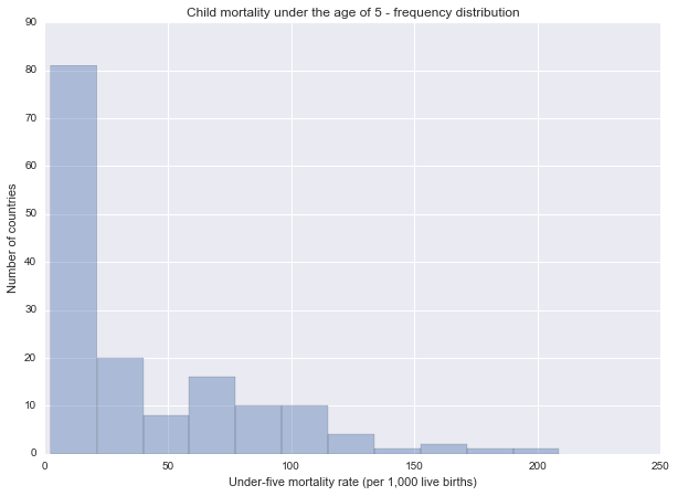
Spread: range from 2.4 to 208.8 (under-five mortality per 1,000 live births). The mean of the variable is 39.708442 with a high standard deviation of 41.935490.
This graph is unimodal, with its highest peak at the lowest category of 1-20. The graph is strongly skewed to the right as most of the observations are located in the lowest category with fewer observations in the other categories.
Mean years in school
Description of the womenschool variable
Describe mean years in school
count    154.000000
mean       9.011039
std        3.483417
min        1.300000
25%        6.225000
50%        9.900000
75%       11.900000
max       14.700000
Name: womenschool, dtype: float64
Univariate graph for mean years of schooling for women
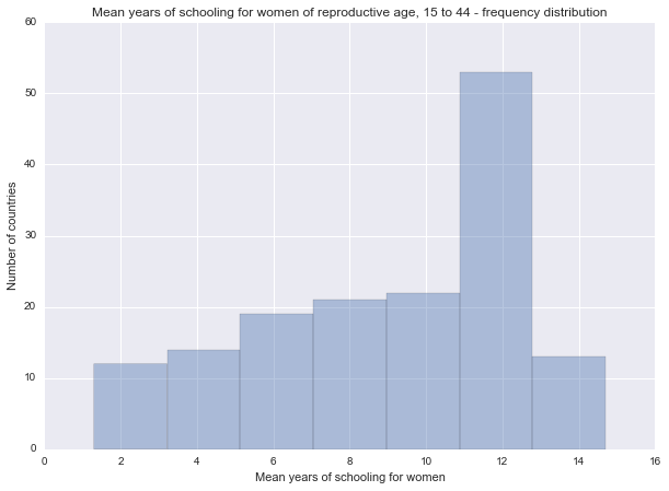
Spread: range from 1.3 to 14.7 years. The mean is 9.011039, standard deviation is 3.483417.
The unimodal graph has a peak at 10-12 years. It's skewed-left distribution showing a tendency of increasing frequency from lower to higher categories.
Health expenditure
Description of the healthexpend variable
Describe health expenditures
count     154.000000
mean     1026.758235
std      1781.976820
min        11.903500
25%        73.886563
50%       270.191643
75%       859.051710
max      8361.732117
Name: healthexpend, dtype: float64
Univariate graph for total expenditure on health
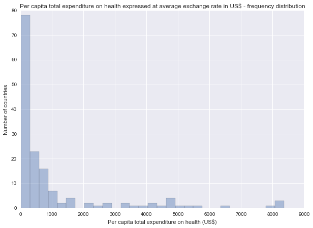
Spread: range from 11.903500 to 8361.732117 (per capita US$). The mean of the variable is 1026.758235 with a high standard deviation of 1781.976820.
The unimodal graph shows an extreme skewed-right distribution with a peak at around 1-300 US$.
Income per person
Description of the incomeperperson variable
Describe income per person
count      154.000000
mean      7082.552210
std      10429.868464
min        103.775857
25%        726.172683
50%       2288.445126
75%       8020.798175
max      52301.587179
Name: incomeperperson, dtype: float64
Univariate graph for income per person
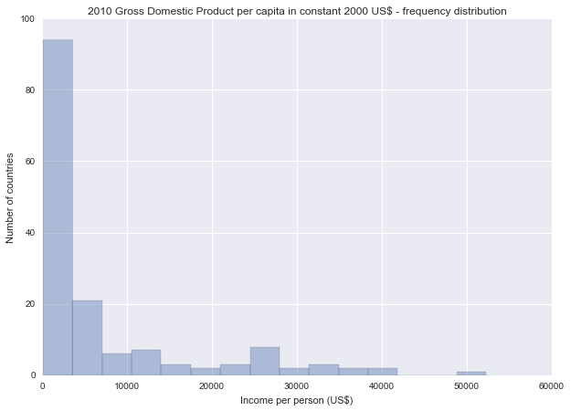
Spread: range from 103.775857 to 52301.587179 (per capita US$). The mean of the variable is 7082.552210 with a standard deviation of 10429.868464.
This graph is unimodal, with its highest peak at the first bin of Income per Person. It is skewed to the right as most countries are located at the low – lower middle income levels.
Plotting bivariate distributions
Female education and child mortality
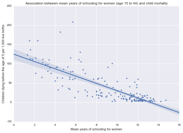
The bivariate analysis of under5mort (response variable) as compared to womenschool (explanatory variable) shows a negative relationship between the two variables. In the scatterplot we can see that a higher educational realization by mothers is associated with lower child mortality rates within countries. So, my original hypothesis ”...more education for women is an important factor in reducing the rate of death among children...” seems to be supported by this data.
Health care and child mortality
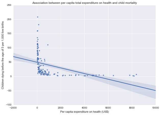
The second analysis is a comparison of health expenditure and child mortality. The graph shows a negative relationship between the variables: high expenditure on health more generally comes along with lower levels of child mortality. According to the previous frequency analysis in 75.44% of the studied countries the per capita expenditure on health is below 1000 US$. Further examination of this group could reveal more details about the discussed correlation.
Income per person and child mortality
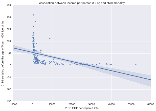
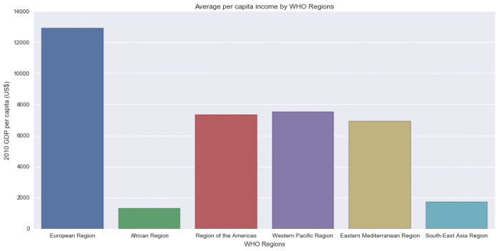
Income level of the country shows negative relationship with child mortality rate: the poorest countries have the highest levels of child mortality, and the countries with the highest income have the lowest rates.
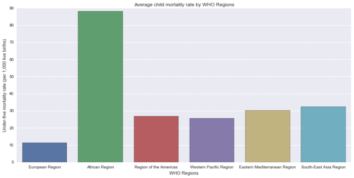
The two bar graphs below show that in the African region, where the per capita income is the lowest, child mortality is at an extremely high level compared to the other regions. Of course there are many factors other than GDP per capita that contribute to this result, but those variables are beyond the scope of this brief study.
Child mortality by WHO Regions
Per capita income by WHO Regions
Python code
    # -*- coding: utf-8 -*-
    # Created on 28/07/2016
    # Author Ernő Gólya

    %matplotlib inline
    # Import libraries
    import pandas as pd
    import numpy as np
    import seaborn
    import matplotlib.pyplot as plt

    # Reading in data file
    data = pd.read_csv('custom_gapminder_2.csv', low_memory=False)

    #Set PANDAS to show all columns in DataFrame
    pd.set_option('display.max_columns', None)
    #Set PANDAS to show all rows in DataFrame
    pd.set_option('display.max_rows', None)

    # bug fix for display formats to avoid run time errors
    #pd.set_option('display.float_format', lambda x:'%f'%x)

    # Setting variables to numeric
    data["incomeperperson"] = pd.to_numeric(data["incomeperperson"],errors='coerce')
    data["under5mort"] = pd.to_numeric(data["under5mort"],errors='coerce')
    data["womenschool"] = pd.to_numeric(data["womenschool"],errors='coerce')
    data["healthexpend"] = pd.to_numeric(data["healthexpend"],errors='coerce')

    # Remove observations with NaN values in any variables of interest
    # Describe function returns NaN for percentiles if dataset contains NaN
    data = data.dropna()

    # Creating categories for quantitative variables
    data["incomeperperson_cat"] = pd.cut(data.incomeperperson, [1, 1000, 4000, 12000, 65000],
                                        labels=["Low", "Lower middle", "Upper middle", "High" ])
    data["under5mort_cat"] = pd.cut(data.under5mort, [1, 40, 80, 120, 160, 220],
                                    labels=["0-40","40-80", "80-120", "120-160", "160-220"])
    data["womenschool_cat"] = pd.cut(data.womenschool, [0, 4, 8, 12, 16],
                                    labels=["0-4 years", "4-8 years", "8-12 years", "12-16 years"])
    data["healthexpend_cat"] = pd.cut(data.healthexpend, [1, 500, 1000, 2000, 5000, 9000],
                                         labels=["1-500", "500-1000", "1000-2000", "2000-5000", "5000-9000"])

    # Descriptive statistics for quantitative variables
    desc1 = data["under5mort"].describe()
    desc2 = data["womenschool"].describe()
    desc3 = data["healthexpend"].describe()
    desc4 = data["incomeperperson"].describe()
    print "Describe child mortality under 5"
    print desc1
    print ""
    print "Describe mean years in school"
    print desc2
    print ""
    print "Describe health expenditures"
    print desc3
    print ""
    print "Describe income per person"
    print desc4
    # Univariate bar graph for categorical variable - not printed
    fig=plt.figure(figsize=(10, 7), dpi= 80, facecolor='w', edgecolor='k')
    seaborn.countplot(x="under5mort_cat", data=data);
    plt.xlabel('Under-five mortality rate (per 1,000 live births) categories');
    plt.ylabel('Number of countries')
    plt.title('Child mortality under the age of 5 - frequency distribution');

    # Univariate histogram for quantitative variable
    fig=plt.figure(figsize=(10, 7), dpi= 80, facecolor='w', edgecolor='k')
    seaborn.distplot(data["under5mort"].dropna(), kde=False, rug=False);
    plt.xlabel('Under-five mortality rate (per 1,000 live births)');
    plt.ylabel('Number of countries')
    plt.title('Child mortality under the age of 5 - frequency distribution');

    # Univariate bar graph for categorical variable - not printed
    fig=plt.figure(figsize=(10, 7), dpi= 80, facecolor='w', edgecolor='k')
    seaborn.countplot(x="womenschool_cat", data=data);
    plt.ylabel('Number of countries')
    plt.xlabel('Mean years of schooling for women categories');
    plt.title('Mean years of schooling for women of reproductive age, 15 to 44 - frequency distribution');

    # Univariate histogram for quantitative variable
    fig=plt.figure(figsize=(10, 7), dpi= 80, facecolor='w', edgecolor='k')
    seaborn.distplot(data["womenschool"].dropna(), kde=False, rug=False);
    plt.ylabel('Number of countries')
    plt.xlabel('Mean years of schooling for women');
    plt.title('Mean years of schooling for women of reproductive age, 15 to 44 - frequency distribution');

    # Univariate bar graph for categorical variable - not printed
    fig=plt.figure(figsize=(10, 7), dpi= 80, facecolor='w', edgecolor='k')
    seaborn.countplot(x="healthexpend_cat", data=data);
    plt.ylabel('Number of countries')
    plt.xlabel('Per capita total expenditure on health (US$) categories');
    plt.title('Per capita total expenditure on health expressed at average exchange rate in US$ - frequency distribution');

    # Univariate histogram for quantitative variable
    fig=plt.figure(figsize=(10, 7), dpi= 80, facecolor='w', edgecolor='k')
    seaborn.distplot(data["healthexpend"].dropna(), kde=False, rug=False);
    plt.ylabel('Number of countries')
    plt.xlabel('Per capita total expenditure on health (US$)');
    plt.title('Per capita total expenditure on health expressed at average exchange rate in US$ - frequency distribution');

    # Univariate bar graph for categorical variable - not printed
    fig=plt.figure(figsize=(10, 7), dpi= 80, facecolor='w', edgecolor='k')
    seaborn.countplot(x="incomeperperson_cat", data=data);
    plt.ylabel('Number of countries')
    plt.xlabel('Income per person (US$) level');
    plt.title('2010 Gross Domestic Product per capita in constant 2000 US$ - frequency distribution');

    # Univariate histogram for quantitative variable
    fig=plt.figure(figsize=(10, 7), dpi= 80, facecolor='w', edgecolor='k')
    seaborn.distplot(data["incomeperperson"].dropna(), kde=False, rug=False, bins=15);
    plt.ylabel('Number of countries')
    plt.xlabel('Income per person (US$)');
    plt.title('2010 Gross Domestic Product per capita in constant 2000 US$ - frequency distribution');

    # basic scatterplot:  Q->Q
    fig=plt.figure(figsize=(10, 7), dpi= 80, facecolor='w', edgecolor='k')
    scat1 = seaborn.regplot(x='womenschool', y='under5mort', fit_reg=True, data=data)
    plt.xlabel('Mean years of schooling for women')
    plt.ylabel('Children dying before the age of 5 per 1,000 live births')
    plt.title('Association between mean years of schooling for women (age 15 to 44) and child mortality');

    # basic scatterplot:  Q->Q
    fig=plt.figure(figsize=(10, 7), dpi= 80, facecolor='w', edgecolor='k')
    scat2 = seaborn.regplot(x='healthexpend', y='under5mort', fit_reg=True, data=data)
    plt.xlabel('Per capita expenditure on health (US$)')
    plt.ylabel('Children dying before the age of 5 per 1,000 live births')
    plt.title('Association between per capita total expenditure on health and child mortality');

    # basic scatterplot:  Q->Q
    fig=plt.figure(figsize=(10, 7), dpi= 80, facecolor='w', edgecolor='k')
    scat3 = seaborn.regplot(x='incomeperperson', y='under5mort', fit_reg=True, data=data)
    plt.xlabel('2010 GDP per capita (US$)')
    plt.ylabel('Children dying before the age of 5 per 1,000 live births')
    plt.title('Association between income per person (US$) and child mortality');

    # bivariate bar graph C->Q
    seaborn.factorplot(x='who_region', y='under5mort', data=data, kind='bar', ci=None, aspect=2, size=6)
    plt.xlabel('WHO Regions')
    plt.ylabel('Under-five mortality rate (per 1,000 live births)')
    plt.title('Average child mortality rate by WHO Regions');

    # bivariate bar graph C->Q
    seaborn.factorplot(x='who_region', y='incomeperperson', data=data, kind='bar', ci=None, aspect=2, size=6)
    plt.xlabel('WHO Regions')
    plt.ylabel('2010 GDP per capita (US$)')
    plt.title('Average per capita income by WHO Regions');